What's to Love About Responsive Design?
Website design has come a long way. This was what the early net experience looked like. Not any more.
Imagine designing an ad for a newspaper without any dimensional specifications. You have no idea if the ad will be 8” wide or 18” wide. All you know is that the ad will be in color, and art is due on Thursday. Get to work!
I know that sounds absurd, but that is what website designers face today. For web designers, the size of the “newspaper ad” is based on the number of pixels the site visitor can see on their monitor. The challenge is that each visitor to the site can have a different monitor resolution. It’s like designing a print ad for a newspaper that changes size and shape for every copy that comes off the press.
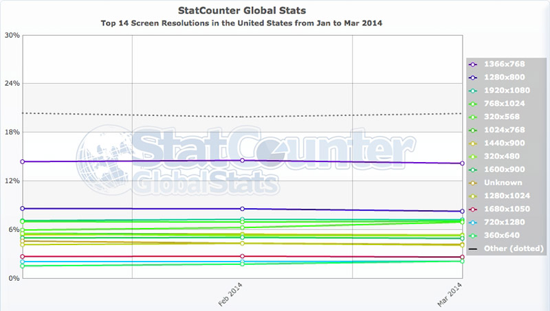
Let take a look at the percentages of users at various resolutions. According to StatCounter, in March 2014, the most prevalent screen resolution was 1366x768 pixels. That resolution wins with approximately 14%. Fourth place is held by 768x1024 (approximately 7%). Fifth place, also at approximately 7%, is 320x568. (Keep in mind that the first dimension is always width and the second dimension is always height.) These are statistics for the U.S.
So, do you design your website at 1366 pixels wide and force those using lower resolutions to scroll around, or do you make your site small, making the user experience frustrating for people with large, high-resolution monitors?
The answer is no. I know, I didn’t ask a yes/no question. The question above has been plaguing web designers for years, and there never was and never will be a good answer to that question. The solution to this issue came about by changing the question.
The solution is responsive design. Design size and layout flexibility while designing layouts. Think about how that newspaper ad layout would change if the ad changed from 8” wide to 18” wide. Some elements might change size. You might want to rearrange elements in the layout. With the use of responsive design, all this is possible.
So - don’t do this:
Design that ecommerce catalog as four products wide and each product gets 240 pixels of width.
Instead, do this:
Design the layout so that products display four across and each product gets 240 pixels of width space for monitors set at 1024 pixels wide but expand each product area up to 360 pixels wide as the screen resolution increases, then leave the live area width at a maximum of 1440 pixels, but if the total width is less than 960 pixels then drop the layout to three products wide and adjust each product width to fill the screen unless the resolution drops below 720 pixels, then rearrange the page to two products wide with a lower limit of 480 pixels wide, and oh, yeah, design a nav that can also be wider or narrower depending on the screen resolution.
At first, this can seem challenging. In practice, it is liberating. It takes some forethought in the design stage, but the impact on implementation (writing the HTML and CSS code) can be relatively minor. For most designs, building one responsive site requires less implementation effort than building a desktop site + a tablet site + a smartphone site.
Now every person visiting your site can get the optimal experience. Mobile users don’t need to pinch-and-zoom to read your content (you may not even need that smartphone app you were thinking about building). Tablet and netbook users see your site at exactly the size of their monitors. Large desktop monitors display a large, easy-to-read site that feels contemporary.
If you want to learn more about how the flexibility of responsive design can revolutionize your online communications, give us a call (800-707-0106 x:123) or contact us today.