The Fastest Upgrade to Responsive Design
If your website does not include a mobile-specific presentation, Google is downgrading you in mobile search results. This is not limited to Flash and other content that breaks on some mobile devices – the Google penalty applies even if your website works on mobile devices but requires pinch-and-zoom.
- Over 1/3 of all U.S. web browsing is done on mobile devices.
- Google provides 80% of all web searches.
- Your search result ranking can significantly impact sales.
Explore our responsive design demo to see how responsive design works and how to design for it.
SPECIAL OFFER: We will convert your desktop-only website to a responsive design site that satisfies Google's mobile requirements for one low price of $3,375.
Special offer price only applies to brochure-style websites that do not include ecommerce, product catalog, or other business processes. Additional fees for migrating content from websites built on any platform other than Dialogs Framework and for responsive design conversion of complex portals, dashboards, complex interactive forms, and other business process content.Testimonial
Dialogs is an amazing strategic partner. They provide a solid foundation to execute strategies for my clients needs and they make me look great in the process!
— Kristina W.Dialogs Responsive Design
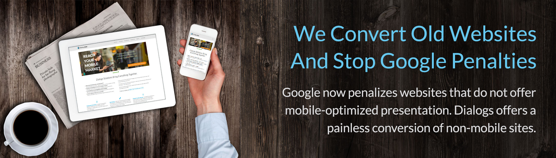
In 2015, Google rolled out a new ranking algorythm for mobile search results that rewards site with mobile-friendly page layouts and penalizes sites that are simply the desktop site squeezed down to the small screen. Google has suggested that responsive design is the most effective approach to avoiding the Google penalty.
Responsive design is an HTML/CSS coding system that allows a website to adjust page layouts based on the size of the browser window. As the size of the window decreases, some content (i.e., photos) might get smaller, but much of the content will arrange differently on the page to allow text to remain readable and clickable items to remain large enough to hit with a finger.
Converting a desktop-only design to responsive design requires an answer to these questions for each piece of content on each page of the site:
- does it scale, or does it move?
- if it moves, where does it go?
- at some point should it go away completely?
Dialogs can help make this process painless. We'll work through every page on your website, review with you how we adapted your design, and then test your new mobile-friendly site to ensure you will no longer feel the impact of the Google penalty.
Pricing Examples
We can quickly add a mobile-friendly presentation to your website to avoid Google penalties.
$ – adapt a simple, brochure-style website already in Dialogs Framework – $3,375
$$ – migrate a simple, brochure-style site from another framework – as low as $5,000
$$$ – migrate content from a complex business site and create a new design – $20,000+
If you need Responsive Design with the power and flexibility of Dialogs, request a quote today.